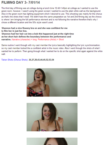
Tuesday 11 March 2014
Monday 10 March 2014


Sunday 9 March 2014
Evalution
In what ways does your media product
use, develop or challenge forms and conventions of real media products?
For my music
video, I chose the song Summertime Sadness which does have a music video by
artist Lana Del Ray who produces alternative rock music and mainly enlightens
the sub-genre Shoegazing. Even though people wouldn’t count alternative rock as
‘mainstream’ Lana has become quite mainstream in the top charts. I chose the
song as not only being a fan of Lana Del Ray, I wanted to bring the meaning of
the lyrics alive through my music video as I wanted to focus on the narrative
and Lana Del Ray’s lyrics are very emotive and raw for example other songs Born to Die and Video Games also I thought being able to represent
the alternative rock/shoegazing target audience was key so they could relate
themselves to the video. The song is a slow pace however becomes more
upbeat at the chorus also artist/DJ Cedric Gervais created a remix of this song even though I
want the original this remix shows the potential of the song. I planned to
create a narrative video with hints of performance from my artist as the song
was not appropriate for major significant of performance however miming and small
movement is used in between the narrative sequences. I was much more interested
in creating a video which was able to represent a love story to the audience. From
looking at my conventions at the start of my project I researched that more
performance-based video was conventional features for an Pop or R&B music
video so by going against the pop genre conventions in my video it would
effectively fit into the codes and conventions for the alternative rock genre.
The main
codes and conventions of music videos for the alternative rock genre is
provoking the audience usually through the narrative by
expressing ‘real life’ that way the audience can feel more involved as now they can not only relate themselves personally to the music
video and narrative but relate their experiences to the artists. The lyrics in
alternative rock tend to be more deep and on topic of personal social concern
making it more depressing then the other genres in the music industry. The
lyrics may be on topic of, drugs, depression, alcohol, and love therefore I
thought it was important to portray a young woman missing her husband as he is
working away in the navy and she sends letters resulting to her becoming depressed and
drinking alcohol. Even though my music video portrays the 50’s decade now in
2014 women whose men are working away in the navy, army etc. today will be in
the same situation.
For example One Republic- Counting Stars highlights the social
concern of religion and I have added this aspect within my music video with the
50’s decade that I am trying to portray religion was highly important in the
1950’s, this shows she is praying to god for her husband to come back home safe
as in this time frame this is a ritual that many wives were doing personally in
their home.

I was also inspired by the narrative structure of this music video there is a straight clear boarder line defining the performance and narrative.
Mariah Purdy- Summertime Sadness
 Narrative
Performance
 My music
video and One Republic’s video both have 2 locations, one for the
performance and one narrative this shows that I have used alternative rock codes and conventions
from this music video to structure my music video as I used the mise-en-scene house location for the Narrative and the green room with my artist against a plain white wall for the performance.
My music
video and One Republic’s video both have 2 locations, one for the
performance and one narrative this shows that I have used alternative rock codes and conventions
from this music video to structure my music video as I used the mise-en-scene house location for the Narrative and the green room with my artist against a plain white wall for the performance.
I was also inspired by the narrative structure of this music video there is a straight clear boarder line defining the performance and narrative.
One Republic- Counting Stars
 Narrative
Performance

Performance
Mariah Purdy- Summertime Sadness
Performance
Continuing
to focus on the mise-en-scene, I chose my house as the prime location for my
video, as the house enabled a vast amount of space and different rooms in the
house to give that ‘real life’ aspect to the music video, the living room, two
different bedrooms, the kitchen, stair case and the front garden (walking
through the front door) so
it was all fitting in with the realistic narrative structure. However I did
find it difficult to not get in the shots the 21st century technology of TVs
etc. and the 21st century deco within the household, furniture,
wallpaper etc. as I was trying to represent the 50’s decade therefore it
limited me in areas where I wanted to film. I used the green room at college for the
chorus which had the performance element this was an advantage for me as me and
my actress go to the same college therefore this was easy access also with me
only having one actress it made it easier focusing on one person’s teenage busy
schedule than several teenagers resulting to the whole filming process not
being time consuming.
At the end of each filming day I created a filming diary, keeping note of the preparation, costume, equipment time frame, shots which were taken, shots which were changed and locations.


 Another convention of alternative rock videos and music
videos in general is for the content to be edited in time with the music. This
ensures that the content of the video follows the song effectively and this is
useful for me as I am using the lyrics to portray the narrative therefore this
is something I made sure I did in my video. However the editing couldn’t be
fast and not have many short clips as this wouldn’t go with the beat of the
song as it is slow pace. Also I had to keep the viewer in mind as I was
conscious that the narrative wasn't enough as I had to make the narrative have
some sort of an effect on them to keep them interested which was a challenge
for me even though at the chorus I did add full lip sync and performance. Adding to this I didn't want every single
shot to be framed perfectly in the screen (some shots being purposely handheld,
shaken, askew or not directly in shot) as I thought this would add to the ‘real
life’ ideology which I was trying to represent by making some shots look
slightly off point, I feel that this connotes my narratives characters frame of
mine also.
Another convention of alternative rock videos and music
videos in general is for the content to be edited in time with the music. This
ensures that the content of the video follows the song effectively and this is
useful for me as I am using the lyrics to portray the narrative therefore this
is something I made sure I did in my video. However the editing couldn’t be
fast and not have many short clips as this wouldn’t go with the beat of the
song as it is slow pace. Also I had to keep the viewer in mind as I was
conscious that the narrative wasn't enough as I had to make the narrative have
some sort of an effect on them to keep them interested which was a challenge
for me even though at the chorus I did add full lip sync and performance. Adding to this I didn't want every single
shot to be framed perfectly in the screen (some shots being purposely handheld,
shaken, askew or not directly in shot) as I thought this would add to the ‘real
life’ ideology which I was trying to represent by making some shots look
slightly off point, I feel that this connotes my narratives characters frame of
mine also.

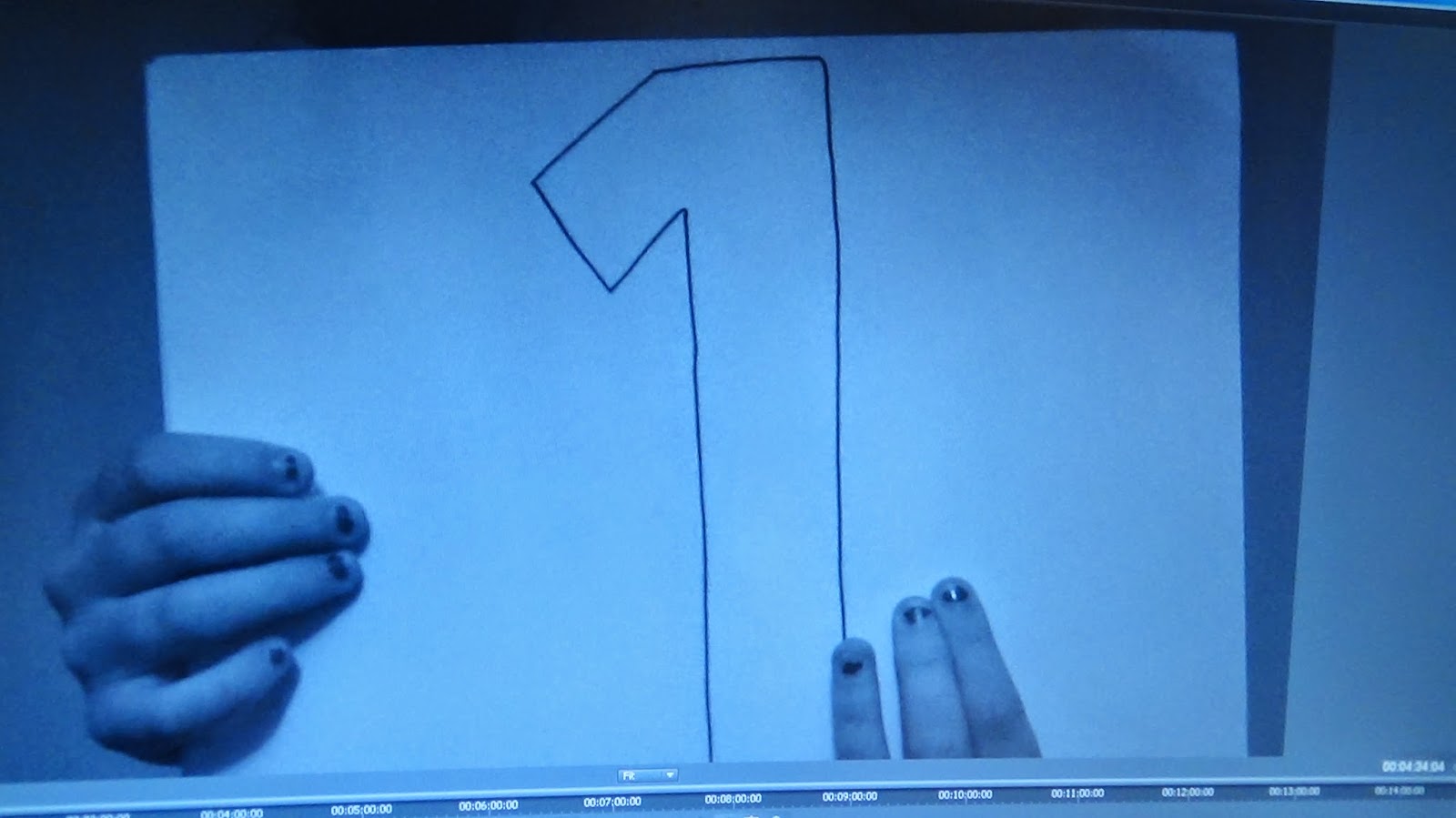
 Although I also began my music video with the element of
performance by using boards with numbers drawn on, I felt this added something
more to the narrative as by having a countdown indicates that it’s counting
down for the story to begin and this could connote the ‘film leader’ which used
to be used before films began and I did research on this in the pre-production.
I felt it signified a creative aspect (hand drawn) and added a more personal
touch to my video as well as reinforcing that my artist is less mainstream with
the boards being roughly hand drawn I also thought it would help the audience
become more connected with the video’s narrative as it enabled them to know it
is a story and they could relate. I feel the lyrics did link with the content
of my music video successfully; the main lyrics being ‘Summertime Sadness’
suggesting summertime is usually a happy time however this video is going to
show the sadness with the summer season.
Although I also began my music video with the element of
performance by using boards with numbers drawn on, I felt this added something
more to the narrative as by having a countdown indicates that it’s counting
down for the story to begin and this could connote the ‘film leader’ which used
to be used before films began and I did research on this in the pre-production.
I felt it signified a creative aspect (hand drawn) and added a more personal
touch to my video as well as reinforcing that my artist is less mainstream with
the boards being roughly hand drawn I also thought it would help the audience
become more connected with the video’s narrative as it enabled them to know it
is a story and they could relate. I feel the lyrics did link with the content
of my music video successfully; the main lyrics being ‘Summertime Sadness’
suggesting summertime is usually a happy time however this video is going to
show the sadness with the summer season.
Originally I got this idea from Bob Dylan’s music video of Subterranean Homesick Blues as I researched this very early in pre-production. This demonstrates an artist using boards to illustrate lyrics visually to the audience. I feel that by doing this, Bob Dylan breaks the conventions of music videos during this time frame without a traditional element of performance, helping the audience become more involved with the meaning behind the lyrics as they actively read from the screen. However writing the lyrics in my music video wouldn't of worked well and I wouldn't of been able to portray my chosen narrative therefore I feel the conscious decision of using this idea but changing it to numbers was very successful.


 Miming Lyrics
 Medium Close-up

'MALE GAZE' - Representation Theory - VOYEURISM
 I can apply this theory already to my 1st day of filming - 1/12/13. The main scene which I am going to apply this theory to it to is shot no.12; the mise-en-scene of the costume is a red dress, which represents my artist as being confident and maybe dangerous. Also this costume highlights that she is the main character as it vibrant and attention seeking. The cinematography I have choose is an upwards slow tilt which shows my artist body from a males point of view therefore representing her as a sex object and with her dress being red it connotes lust and love. This does touch all the points which are above, emphasises curves of the female body, acting as an object and females are forced to look at the female from the eyes of a man. I can also apply this to my Digipak photos which are below, showing her full body in the red dress and her red dress doesn't cover below the knee therefore showing a lot of her legs.
Also other theorist's which interlinks with this theorist and idea!
John Berger’s (1972)-‘Ways of seeing’
John Berger analyses the manner in which men and women are culturally represented:
•In "Ways of Seeing" Berger claims that the representations of men and women in visual culture entice different "gazes", different ways in which they are looked at.
therefore this concludes showing that both Mulvey and Berger feel that women are the objects for to men
to look at, desire and seek pleasure from.


Magazine Advert


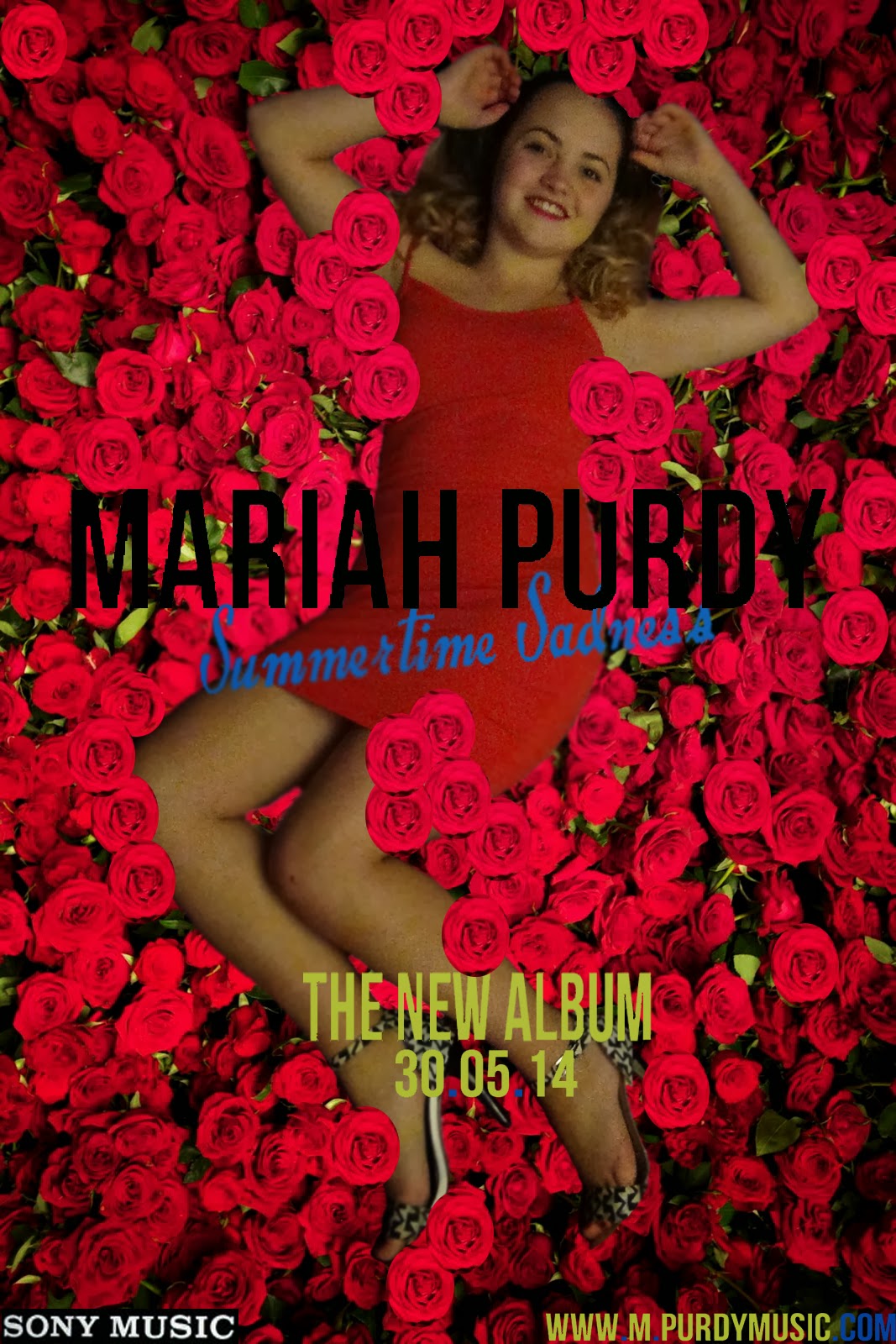
From experimenting first with the texts for my artist’s name I felt showed my development process as I choose the same text to for my magazine advertisement to create continuity from the Digipak to the magazine advertisement.


To create my Digipak I decided to use the photos from the days of my music video for the basic reason of promotional aspects because if I used photos of my artist which has no relation to my music video then I wouldn't be advertising this well also this is a conventional feature which I found through the research process. All the photos on my Digipak have relevance to the music video with the same mise-en-scene: location & costume. However I didn’t use all the photos that I took and in the development process this shows evidence of me experimenting and choosing which images would work the best. After I chose the conscious decision of choosing the 6 panel CD centre placed Digipak layout I then put this template of Adobe Photoshop CS5 and started my Digipak Drafts.
At the end of each filming day I created a filming diary, keeping note of the preparation, costume, equipment time frame, shots which were taken, shots which were changed and locations.
Overall I filmed on 4 separate occasions 2013 through to
2014 accumulating around 7 hours.
With my song being a slow song and alternative rock with the sub-genre shoegazing, I had to make sure the performance and narrative
wasn't been portrayed as ‘fast’ or ‘action’ and with the song being slow I had
the chance to bring the lyrics more to life therefore trying to effectively
represent the narrative. When representing the narrative I
did find difficult making it as interesting as possible as it was difficult to
make the house location seem real but not too average at the same time.
I was happy with my planning process and I wanted to
stick with this strictly however when beginning to film I came up with other
ideas around the house with what would be great shots for the narrative
therefore several shots are different from my storyboard to my final music
video.

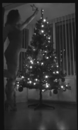 For example, on my storyboard I planned to only see the calendar a few times and the calendar as a whole however in the filming process I chose to show each individual month showing how long the character's husband has been away for and creates a time frame for the narrative.
Another new shot I added was when my character is putting the star on the Christmas tree I felt this fitted with the time frame as I put this shot after the shot of the month 'December' was visually shown.
For example, on my storyboard I planned to only see the calendar a few times and the calendar as a whole however in the filming process I chose to show each individual month showing how long the character's husband has been away for and creates a time frame for the narrative.Another new shot I added was when my character is putting the star on the Christmas tree I felt this fitted with the time frame as I put this shot after the shot of the month 'December' was visually shown.
Another convention of alternative rock videos and music
videos in general is for the content to be edited in time with the music. This
ensures that the content of the video follows the song effectively and this is
useful for me as I am using the lyrics to portray the narrative therefore this
is something I made sure I did in my video. However the editing couldn’t be
fast and not have many short clips as this wouldn’t go with the beat of the
song as it is slow pace. Also I had to keep the viewer in mind as I was
conscious that the narrative wasn't enough as I had to make the narrative have
some sort of an effect on them to keep them interested which was a challenge
for me even though at the chorus I did add full lip sync and performance. Adding to this I didn't want every single
shot to be framed perfectly in the screen (some shots being purposely handheld,
shaken, askew or not directly in shot) as I thought this would add to the ‘real
life’ ideology which I was trying to represent by making some shots look
slightly off point, I feel that this connotes my narratives characters frame of
mine also.
The chorus on the ‘Summertime Sadness’ song begins to get
more upbeat compared to the verses however the key to make my music video blend
I had to ensure that the more upbeat chorus didn't have a too over powering
performance compared to the rest of the song. Therefore I still kept my
artist’s facial expression emotive as possible and a calming performance
throughout when the performance element was needed. Another feature that i used
to define the boundaries I added an effect called ‘ghostly’ this went with the
faster pace beat on the chorus and showed it was not the narrative just a
performance.
Although I also began my music video with the element of
performance by using boards with numbers drawn on, I felt this added something
more to the narrative as by having a countdown indicates that it’s counting
down for the story to begin and this could connote the ‘film leader’ which used
to be used before films began and I did research on this in the pre-production.
I felt it signified a creative aspect (hand drawn) and added a more personal
touch to my video as well as reinforcing that my artist is less mainstream with
the boards being roughly hand drawn I also thought it would help the audience
become more connected with the video’s narrative as it enabled them to know it
is a story and they could relate. I feel the lyrics did link with the content
of my music video successfully; the main lyrics being ‘Summertime Sadness’
suggesting summertime is usually a happy time however this video is going to
show the sadness with the summer season.Originally I got this idea from Bob Dylan’s music video of Subterranean Homesick Blues as I researched this very early in pre-production. This demonstrates an artist using boards to illustrate lyrics visually to the audience. I feel that by doing this, Bob Dylan breaks the conventions of music videos during this time frame without a traditional element of performance, helping the audience become more involved with the meaning behind the lyrics as they actively read from the screen. However writing the lyrics in my music video wouldn't of worked well and I wouldn't of been able to portray my chosen narrative therefore I feel the conscious decision of using this idea but changing it to numbers was very successful.
Early in pre-production
I researched the conventional cinematography used throughout all genres of
music videos, and when coming to filming and drawing the story board this
helped me in deciding how to make my music video look like a real media
product.
SAME CINEMATOGRAPHY TYPES IN MY MUSIC VIDEO
Close-up 
Tilt
Extreme Close-up
'MALE GAZE' - Representation Theory - VOYEURISM
Theorist's Laura Mulvey (1975)
Focuses on Feminism and how males and females perceive women.
•Laura Mulveys concept looks at:
-How the audience view people who are presented in the media.
1) How men look at women from those images.
2) How women look at themselves from those images.
3) How women look at other women from those images.
•The Male Gaze typically focuses on:
- Emphasising curves of the female body.
- Referring to women as objects rather than people.
-The display of women is how men think they should be perceived.
- Female viewers, view the content through the eyes of a man.
 I can apply this theory already to my 1st day of filming - 1/12/13. The main scene which I am going to apply this theory to it to is shot no.12; the mise-en-scene of the costume is a red dress, which represents my artist as being confident and maybe dangerous. Also this costume highlights that she is the main character as it vibrant and attention seeking. The cinematography I have choose is an upwards slow tilt which shows my artist body from a males point of view therefore representing her as a sex object and with her dress being red it connotes lust and love. This does touch all the points which are above, emphasises curves of the female body, acting as an object and females are forced to look at the female from the eyes of a man. I can also apply this to my Digipak photos which are below, showing her full body in the red dress and her red dress doesn't cover below the knee therefore showing a lot of her legs.
Also other theorist's which interlinks with this theorist and idea!
John Berger’s (1972)-‘Ways of seeing’
•He states that ‘men act women appear. Men look at women. Women watch themselves been looked at.’
•The woman is usually posed in a way to please the viewer, her gaze is meant to entice the viewer, and this notion is the same in modern day advertisements and photographs. Berger comments that a woman unconsciously acts in a way knowing she is being viewed. Women are constantly being surveyed, not only by men but by other women, and by themselves.
Jib fowles states ‘in advertising males gaze and females are gazed at’ (Fowles 1996)therefore this concludes showing that both Mulvey and Berger feel that women are the objects for to men
to look at, desire and seek pleasure from.

How effective is the combination of your main product and
ancillary texts?
To create my ancillary texts, I first took plenty of
images of my main actress that featured in my music video to ensure continuity
and uploaded them first on my computer to see which ones was the most effective
when enlarged . I took the images in numerous areas with the house location to
I had a good variety to choose from. After sorting through the images I thought
I could use these for not only my Digipak but my magazine advertisement
therefore I began to edit these images using Adobe Photoshop CS5 to ensure that
the image looked crisp and professional. The image I chose for my magazine
advert was the one of Shannon laid on my bed however I spent plenty of time on
this image editing it so she was laid on a bed of roses.
Here is me searching real media products early in pre- production and I have put them showed them again however in Prezi format so I can easily reference to the conventions. I found the
convention of the use of flowers for a solo female artist therefore I made a
conscious decision to use this convention.
Editing Process
Magazine Advert
With the use of Photo Shop I took one of my original image
where she is laying on a bed and I had an idea for the magazine advert and for
the front cover of my digipak. These initial ideas came from doing my recent
research on real media texts. The feature I found was the theme of flowers
which are very feminine. Therefore I used the Eraser Tool and erased all the
area of the room around her.
After erasing everything around her I was left with
Shannon laying on a blank background.
Then with using the Quick Selection Tool it selected
Shannon's body which I wanted with pressing CTRL button I dragged her across
onto the small flower image. I took this photo at my local florist called
'Florista' then I am planning on Duplicating the small image of flowers and
spread individual flowers and leaves to it doesn't look like the same image has
been copied several times.
Using the Blur Tool I neatened the edge of her. I thought
it didn't look like she was laying on the flowers therefore I thought it was
best if the flowers was softly laying on her making her look like she is
actually in the flowers. To do this I Elliptical Marquee Tool and circled an
individual flower, right clicked and pressed Layer via copy producing just one
flower then I Duplicated this layer to as many flowers that I needed and placed
them in my desired spot near or on her.
I felt this looked really effective for my advert as I felt
she looked feminine and it links with the 50’s decade that I was trying to
portray. The photo is from my 1st filming day therefore she is in
the same costume as the narrative in my music video therefore trying to attempt
my ancillary texts and music video together.
From experimenting first with the texts for my artist’s name I felt showed my development process as I choose the same text to for my magazine advertisement to create continuity from the Digipak to the magazine advertisement.
I searched these fonts on www.dafont.com therefore i went
back on this website and created the rest of the texts in this same font.
I didn't find creating an artist name difficult even
though I did feel that the original artist name to the 'Summertime Sadness'
song was very unique 'Lana Del Ray' but I felt that creating a new identity was
key plus now majority of artist's names are rather ordinary names, however my
actress name is 'Shannon Mariah Purdy' and I felt that 'Mariah Purdy' worked
well as already an artist is called 'Mariah Carey'.
I then set about creating some form of website
information for the audience to be able to contact to buy the album. Also I
felt not using a distribution website like www.amazon.com etc. and creating a
form of website which was the artist personal website makes the audience have
somewhere were they could find other pieces of information about ny artist for
example, events, songs , mechanise etc. I thought creating my own was important
instead of simply copying a known logo for my advert. However I did add a well-known
record label as it would make it look more realistic and professional overall
showing the audience she is a big famous artist.
However I desired the name of the song to be different to
the rest of the text to stand out and I wanted it to be less bold and more
feminine therefore I choose this text still on www.dafont.com.
I named the album after the releasing single as I found
that this was often a convention of all genres of album names also I felt it
was effective. Interestingly, I also thought this name reflected the character,
song and the music video linking them all together as a whole which further
represented the ideology I was trying to create.
I was trying to establish the most effective position for
my artist name without it looking too cluttered as I wanted to keep it as
simplistic as possible and this is a generic convention that I found.
Originally, I wanted a different photo for my magazine advert and show the
Digipak small in the corner however I thought using the same photo as the
Digipak cover but not using the rectangle shapes at each side created
continuity and promotes the Digipak greatly however not using these shapes
defines their different promotional types.
To create my Digipak I decided to use the photos from the days of my music video for the basic reason of promotional aspects because if I used photos of my artist which has no relation to my music video then I wouldn't be advertising this well also this is a conventional feature which I found through the research process. All the photos on my Digipak have relevance to the music video with the same mise-en-scene: location & costume. However I didn’t use all the photos that I took and in the development process this shows evidence of me experimenting and choosing which images would work the best. After I chose the conscious decision of choosing the 6 panel CD centre placed Digipak layout I then put this template of Adobe Photoshop CS5 and started my Digipak Drafts.
I felt that creating more drafts you would get the best result
as you try different designs. Overall I created 5 drafts, 4 without audience
feedback and the 5th is the final as I got feedback on the 4rd
draft to create the final 5th.


I used the same colour scheme throughout both pieces
to achieve this, green, red, black and blue I got these colours from the
costume and the roses and leaves as I felt using this colour scheme represented
the music video and the colour red connotes love and lust which my music video
is in the theme of love. The girly and feminine theme was what I was trying to
represent in the Digipak and I feel that from the colour scheme it has that
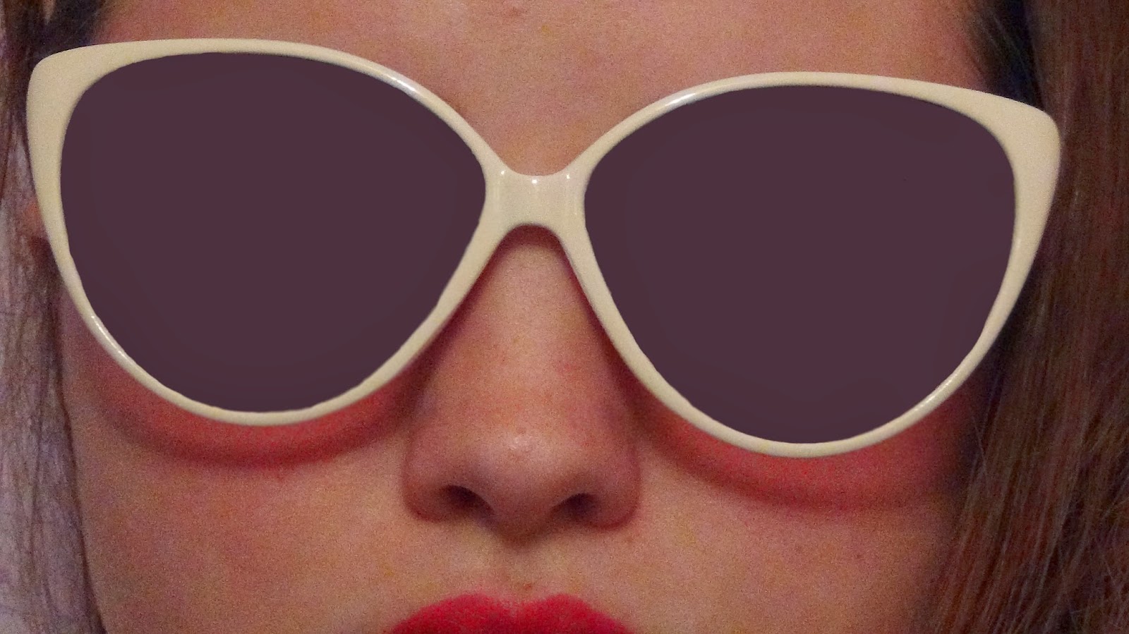
female touch. On one of the inside covers I used the image of her wearing the
sunglasses the design of the sunglasses was ‘cat’ shaped and this was a big
wear in the 50’s therefore I felt this image was good to use as it represented
the decade I was portraying in my music video.
A difficultly which I had with this image is that you could see the reflection
of me filming through the sunglasses therefore using the paint brush tool on
Adobe Photo Shop CS5 I had to colour the sun glasses in however creating a
solid block colour made the glasses look more 50’s.
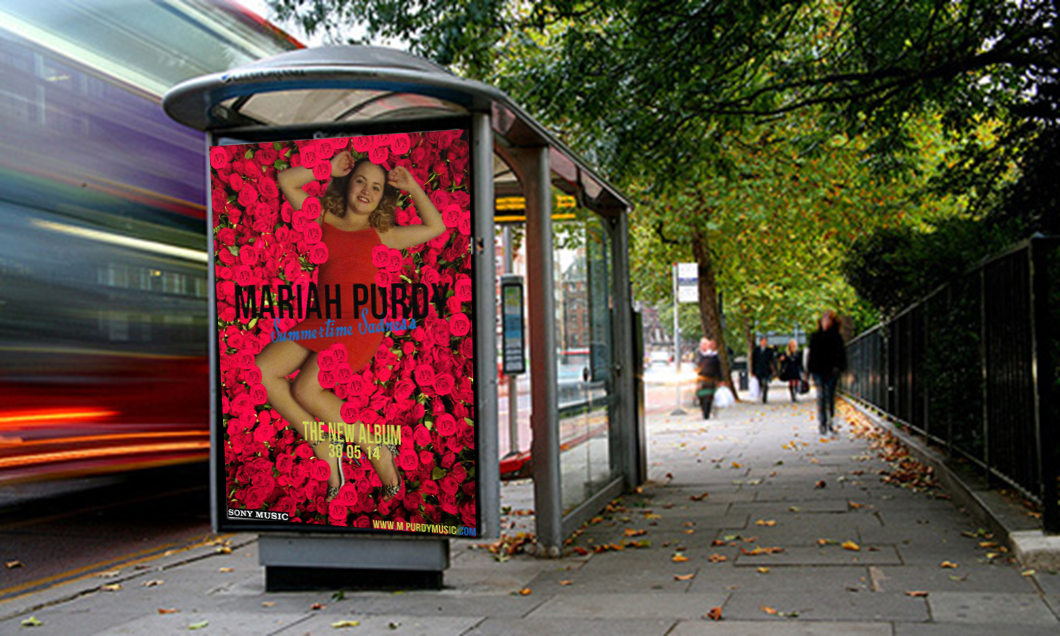
 I also thought it was important to portray both my
magazine advert and Digipak in the real world/real life setting. Resulting in
this idea I made a conscious decision to edit my promotional products onto real
life settings for example, bus stop advertisement,
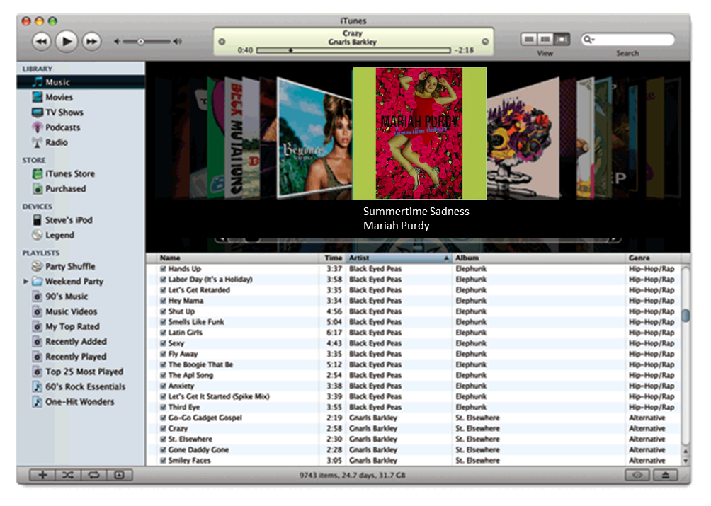
iTunes and Q magazine.
I thought iTunes was to be the most popular way my target audience would access
digital music, so would be helpful to see the album as if it was actually being
played by my target audience, this shows how realistic it would look and
overall if it does look like a real media product therefore in my opinion my
promotional products do look effective placed into real life settings.
I also thought it was important to portray both my
magazine advert and Digipak in the real world/real life setting. Resulting in
this idea I made a conscious decision to edit my promotional products onto real
life settings for example, bus stop advertisement,
iTunes and Q magazine.
I thought iTunes was to be the most popular way my target audience would access
digital music, so would be helpful to see the album as if it was actually being
played by my target audience, this shows how realistic it would look and
overall if it does look like a real media product therefore in my opinion my
promotional products do look effective placed into real life settings.
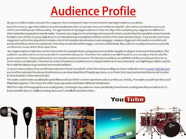
Firstly, here is my target audience and audience profile which I researched and created early in pre-production.

The first audience
feedback which I did early in pre-production was a focus group with
3 students from my Media Studies class and these where the questions which were
asked:
1. What conventions
would you expect from an alternative rock music video?
2. How do you mostly
access music videos?
3. What is your
favourite alternative rock song?
4. What is your
favourite alternative rock music video?
5. Why is this your
favourite alternative rock music video?
6. Any genre, which
music video made you want to go out and buy the song?
7. What do you think is
the most important aspect in a music video?
What did I learn from this?
Blue= What I did
Red= What I did Slightly
Black = What I didn't do
Quotations from the focus group from Q1, Q5,Q6,Q7 as these questions where the ones which helped me when filming.
Blue= What I did
Red= What I did Slightly
Black = What I didn't do
Quotations from the focus group from Q1, Q5,Q6,Q7 as these questions where the ones which helped me when filming.
Q1) 'singing into the camera' 'dark lighting' 'serious story lines' 'narrative and performance piece' 'Leather Jackets'
Q5) 'Abstract' 'gives emotion' 'quite funny' 'I don't have a favourite but like performance from the band'
Q6) 'made me laugh pretty silly' 'buy it for the music not the actual video' 'Lana Del Ray National Anthem'
Q7) 'definitely the performance' 'narrative like the story as I think it keeps it interesting' 'performance and narrative I think they go hand in hand'
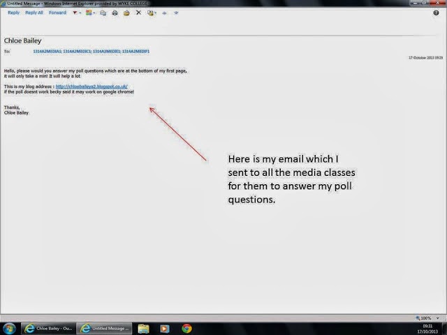
The second audience feedback that I began was a poll on my blog which I asked questions to the audience on music videos in general. I sent this to all the media classes at A2 level through the Wyke College email asking politely to quickly click on the link to my blog and answer the following questions.
Q5) 'Abstract' 'gives emotion' 'quite funny' 'I don't have a favourite but like performance from the band'
Q6) 'made me laugh pretty silly' 'buy it for the music not the actual video' 'Lana Del Ray National Anthem'
Q7) 'definitely the performance' 'narrative like the story as I think it keeps it interesting' 'performance and narrative I think they go hand in hand'
The second audience feedback that I began was a poll on my blog which I asked questions to the audience on music videos in general. I sent this to all the media classes at A2 level through the Wyke College email asking politely to quickly click on the link to my blog and answer the following questions.
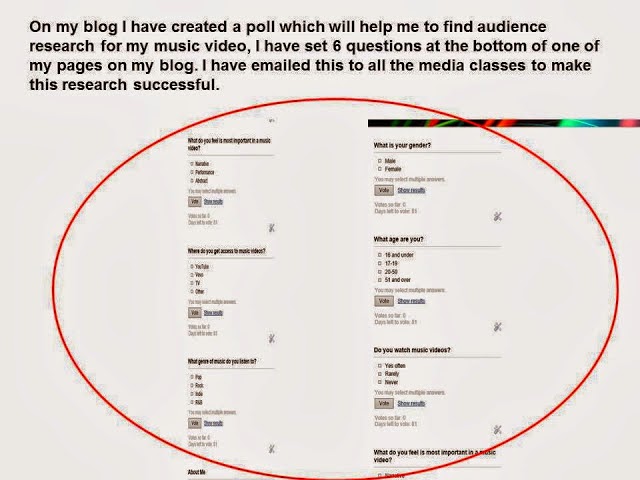

Poll charts! from chloebailey12
I created 4 drafts of my Digipak and the 5th being my final product and after each draft I highlighted the improvements.


I asked a several people within my target audience questions after showing them my final video.
How did you use media technologies in the construction and research, planning and evaluation
I created 4 drafts of my Digipak and the 5th being my final product and after each draft I highlighted the improvements.
With the 4th draft I did
audience feedback and I created questionnaires. I gave this to not only Wyke
Students but to my Media teacher Rebecca Ives as she will have good knowledge
to tell me what to improve also she is still in the age range of my target
audience. All together I gathered 7 questionnaires.
This then helped me
create my final product.
I asked a several people within my target audience questions after showing them my final video.
The first question I asked was ‘What did you like about
the music video?’ this question is rather broad so the audience couldn’t focus on one
thing this enabled to get the specific feature which in their opinion what they
liked the most about it. Majority said it wasn’t boring as the performance and
narrative worked well and each person highlighted that the use of the sun faded
through my artist miming the chorus was great to reflect summertime. The second
question was ‘What would you add or change about the video?’ as a group they
decided that every time I showed a month I should of reflected that month
straight after like I did for the month December I had the Christmas tree shot
after this. The third question I asked was ‘Do you think the video looks
realistic?’ this is a great question to ask as everyone will know if the
narrative would happen in real life. Mostly said adding the sun, sky and moon
added a time frame for the narrative therefore made it more realistic also the
location of an average house made it realistic as a whole as the target
audience said their households where very similar plus all agreed the story could happen to anyone. The fourth question I asked
was 'Do you think the narrative is on a serious topic?’ mostly the females
thought it was more on serious topic as they could relate more compared to the
males as my narrative was focused on a female, I asked this question as in the
alternative rock genre having the narrative on an provoking topic is a strong
conventional feature although both genders did know that it was focusing on the theme of
love and heart break and showing the character drinking alcohol they said this
then provoked them more. One person highlighted that with the narrative being
in black and white these colours made the narrative seem more serious as these
are more dull and depressing colours. The fifth question that I asked was 'Does
the music video reflect the song Summertime Sadness?’ all the feedback was
positive which was great as they said the chorus performance reflected ‘Summertime’
with it being in colour and the sun shining through her and the narrative reflected the ‘Sadness’ with it being in black and white.The sixth question I asked was ‘Do you think the music video reflects
the 50’s decade?’ majority said yes as I didn’t include any 21st
century technology and the mise-en-scene of my character’s hairstyle and costume
reflected the decade the most however they did add that I could of got some
props like an old fashioned telephone or a 50’s household product to make it
more realistic for that decade because they did highlight that it could still
reflect todays time frame. The seventh question I asked was ‘Who do you think the target audience
is?’ this question was important as I wanted to know what target audience they
thought but if they thought it appealed to them as they was my target audience.
I asked them as a group to say an age range and they agreed 16 to 30 they wasn’t
too far off as my actual target audience is 16 to 26yrs they said the narrative
was rather mature and would appeal to a person up to 30 therefore this answer
suggests that I have created a video which successfully appeals to the audience
which I intended and desired to appeal to.I left this question till last as I thought this question summed up my
music video and was down to this question if my music video was successful or
not ‘Do you think the music video follows the conventions of an alternative
rock music video?’ all the people I asked where media students and was familiar
with the alternative genre therefore I made sure they all had the knowledge to
answer this question and they did, however, I was prepared if any of them didn’t
as I could showed them existing alternative rock music videos and show my
research from my early pre-production like my Prezi’s etc.The whole feedback for this question was positive with some hints of negative,
some thought it followed the conventions in terms of having narrative and
performance and with the narrative being a serious topic however others thought
it wasn’t as dark and depressing as some alternative rock music videos are and
they would have expected more sheer and raw storylines.
How did you use media technologies in the construction and research, planning and evaluation
stages?

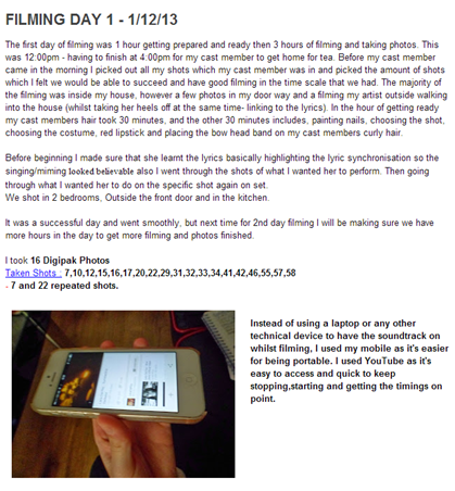
I used YouTube to upload the health and safety clips also
my final video:
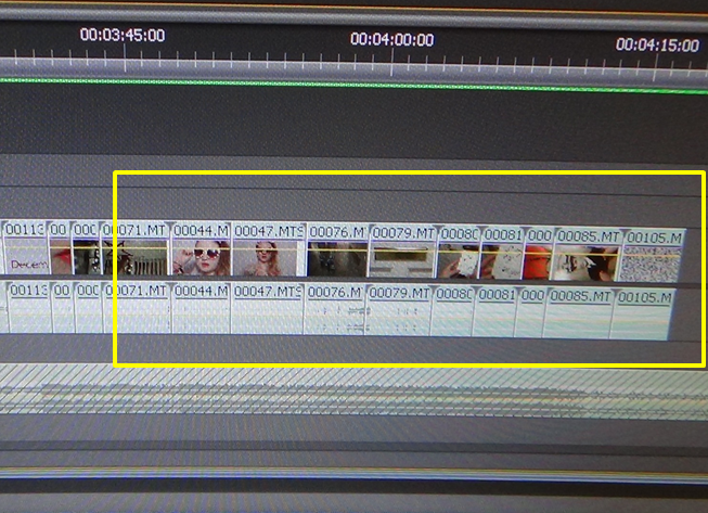
Adobe Premierpro CS6 was the main technology which I used
to create my music video, this programme was all accessible through the college
editing suite. I first uploaded all the footage immediately after it all the
filming days that I did naming the folders under as shoot 1, shoot 2 and so on
so my filming was all organised also to organise my filming before I started
creating anything I went through the shots named them by the shot numbers using
my story board and if I wasn’t using a shot named under as ‘not using’. This
programme allowed me to cut and re-size clips, add special effects, increase or
decrease sleep of clips (speed/duration) and adjust sound and volume etc. I had
no previous experience with this programme so found it difficult as first but
after 2 sessions of practising I was well away and in the zone. I started to
practise before Christmas and I look back now and I think that I was organised
and glad I did it that early because now I am fully confident with this system.
I chose this programme over alternative ones such as Final Cut Pro which was on
the Mac Suites and Windows Movie Maker as from hearsay and asking my teachers
which was best the feedback was that it was very complex, great programme and
the best results are seen off here as it enabled the littlest detail and
precise cutting and placing of clips overall enabling my music video to look
professional and a real media product.
I chose to use a Sony Handy cam to
film all of my videos on rather than any other larger camera. Not only was
 college providing this camera I already planned to buy this camera so from
experience looking at information about this technology and consuming this
product I knew it was going to be great quality. This camera allowed me to save
all my filming on a memory card rather than a tape etc. as I thought this would
be an easier and convenient way when uploading to the editing suite as when
coming to the editing process it would be less time consuming. Also I knew I
would have a lot of filming this then let me have many hours of footage and the
memory not get full as it would have got full quicker on a tape or any other
memory device. On reflection I am glad with the camera I used as the quality was
great and it looks professional however if I had the option and a longer space
of time I would of picked a larger camera as numerous of the long shots it would
have been easier with a larger camera.
college providing this camera I already planned to buy this camera so from
experience looking at information about this technology and consuming this
product I knew it was going to be great quality. This camera allowed me to save
all my filming on a memory card rather than a tape etc. as I thought this would
be an easier and convenient way when uploading to the editing suite as when
coming to the editing process it would be less time consuming. Also I knew I
would have a lot of filming this then let me have many hours of footage and the
memory not get full as it would have got full quicker on a tape or any other
memory device. On reflection I am glad with the camera I used as the quality was
great and it looks professional however if I had the option and a longer space
of time I would of picked a larger camera as numerous of the long shots it would
have been easier with a larger camera.


I used Prezi and Slide Share in elements of my advanced portfolio as I expressed
my ideas and planning process instead of typing every word up I felt
it was a creative way to bring my thoughts to an interactive level. This included
aspects of codes and conventions of the cinematography from all genres of music
videos which I wanted to use to make my music video conventional this helped me
when filming as this was a planning process of cinematography. I used Slide Share to put my power points on this was very easy as instead of putting each
individual l page of a power point on blogger I could put the whole power point on for example I used this to show my audience research graphs.
Adobe Photoshop CS5 was the technical programme in which I used to create both my ancillary texts on, my magazine advert and my Digipak. I already had recent experience from this programme, using this for my AS Media Studies Portfolio so I was very confident from the start as I was already used to this system, this made it less time consuming as I didn’t have to make spare time learning out to use this. With this system I was able to: upload images and edit these effectively, colour adjustment tools, crop/re-size images, adding several pieces of texts uses the layers resulting to being able to create my ancillary texts the way I imagined them in my head and how I desired them to look. Overall this programme helped my ancillary texts look professional and like a real media product in contrast to Microsoft Publisher, Microsoft Word and PowerPoint2010 as I was able to edit thoroughly and in my detail.

 For my research I
wouldn't have been able to research without Web 2.0 as this gave me access to www.google.com where I could search
conventional features for my ancillary texts and music videos also Web 2.0 let
me access YouTube which I mentioned just above.
For my research I
wouldn't have been able to research without Web 2.0 as this gave me access to www.google.com where I could search
conventional features for my ancillary texts and music videos also Web 2.0 let
me access YouTube which I mentioned just above.Word Count: 5,703
Subscribe to:
Posts (Atom)